
Zoe Norvell has been designing book covers professionally since 2011, and has designed nearly 700 covers to date. Zoe started her career in New York City as an in-house designer at Simon & Schuster and then moved over to Penguin Random House. In 2015, she began freelancing full-time. Today, Zoe is based in her hometown of Washington, DC, and when not global pandemic times, loves to travel and will occasionally bring work with her on the road.
Zoe recently launched “INeedaBookInterior.com”, which she describes as “a small company that does one thing really well: creating impeccable book interiors, while making the process super simple for clients.”
We interviewed Zoe for the Viewless Wings Poetry Podcast. Below is an edited transcript of the interview, which can be heard in full here:
James Morehead: Before I dive into the complex process of designing a book, what are some of the books you enjoyed as a child that have stood the test of time, from a design perspective?
Zoe Norvell: “I love this question. The first thing that comes to mind is anything by Shel Silverstein. His books were for kids, but they weren’t filled with colorful illustrations. They were one color books and I feel like everyone can imagine certain pages from one of his books. The way that the lines were applied on the page, and [how he] played around with white space and the rectangle of the page. It was so forward thinking. Where the Sidewalk Ends or The Missing Piece, that’s what really comes to mind for me.”
Morehead: There’s a well worn expression, “to never judge a book by its cover”, but I believe book covers are critically important to set the tone of a book, and to signal to the reader the care taken in developing the book. What’s your take on that expression?
Norvell: “I think that any time someone uses that expression, they’re referring to anything other than a book, they’re talking about a person or an experience they had, but no one ever uses that expression as it relates to a book. I think everyone depends on their own impressions of what book covers mean to them in selecting a book. If you went to a bookstore and bought what you thought was a thriller because it had dark shadowy trees on it, and you got home and it was a romance from the 1600s you’d be really pissed! Why did someone fool me into buying this book? We all have to judge books by their covers and it’s to our advantage that we do.”
Morehead: “I chose to self publish my first and upcoming books, both of which you designed, which gave me tremendous control over the process. I was also inundated with countless decisions. Break down how you approach simplifying the complex design process for clients without sacrificing the quality of the product.”
Norvell: “As it relates to book covers, the first thing I do is send my client, whether it’s an author or publisher, a simple, one-page PDF that has everything that I need to design the book cover. One of those things is the trim size. It’s really important to me that when I start off designing it’s the right dimension. Some people, particularly with authors, not so much publishers, maybe haven’t thought about the trim size yet. So this forces them.
“We’re going to start thinking about this book as a physical object. Do your research and figure out what the trim size is and then I’ll start designing. I need all the text that is going to be on the cover. The worst thing is getting a quote added on at the last minute. Where are we going to fit this quote? It’s great to have all the text in the beginning.
“The look and feel of your book. Usually, I just ask people to give me words. Do you want this to be bold, or quiet? Do you want this to be modern or timeless?
“I need to know the client’s stock budget because the artwork that I use to create the cover is super important. Sometimes people haven’t thought about that either. I get all of this information from the client, and read the manuscript to get my own take on the work, then I go to work. Within two weeks I’ll come back to the client with a PDF of cover options.
“The best case scenario is you knock it out of the park in round one, and maybe the tweaks are as small as ‘Can you make this word red instead of blue’, and sometimes none of it works. I don’t take it personally because that happens, and it really informs the second round. Sometimes the first round creates a whole conversation between the author, the editor, the publisher, and through that conversation, comes a completely new direction. And then from there it’s a bunch of minor tweaks or it’s a complete redo, and we just keep going at it.”
Morehead: What role does the manuscript play in addition to the design brief and other input you get from the art director or author?
Norvell: If it’s nonfiction, I don’t go so heavily into the manuscript. So let’s take Malcolm Gladwell, for example. All of his books can really be distilled in one sentence. That’s the essence of what he’s trying to say in 300 pages. And that’s what we need to put on the cover. I don’t need to read every single page. All of the examples that he’s giving reinforce the point he’s making so I don’t need to read the whole thing to figure out what goes on the cover.
“When it’s fiction, things are very different, maybe something that happens in the end is super important and that defines a cover. Maybe the first half of the book takes place in New York City and the second half takes place in a cabin. Which one do we want to put on the cover? What are the characters like? What is the feeling of the book? Maybe the cover doesn’t have anything to do with the setting, maybe it’s all about the feeling. Maybe the voice of the character changes by the end. I rely heavily on the manuscript when it’s fiction. I read the manuscript as quickly as you would if you were prepping for a college test. I don’t have time to make a cup of tea and cozy up in a chair and read. I am reading for work and time is of the essence, but I absolutely depend on the manuscript when it comes to certain genres.”
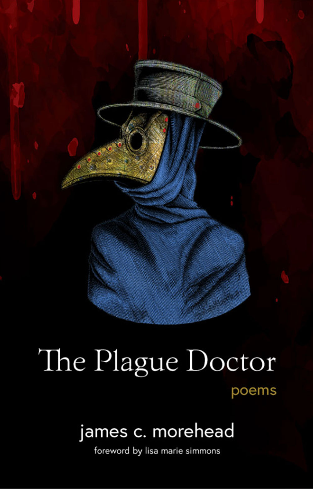
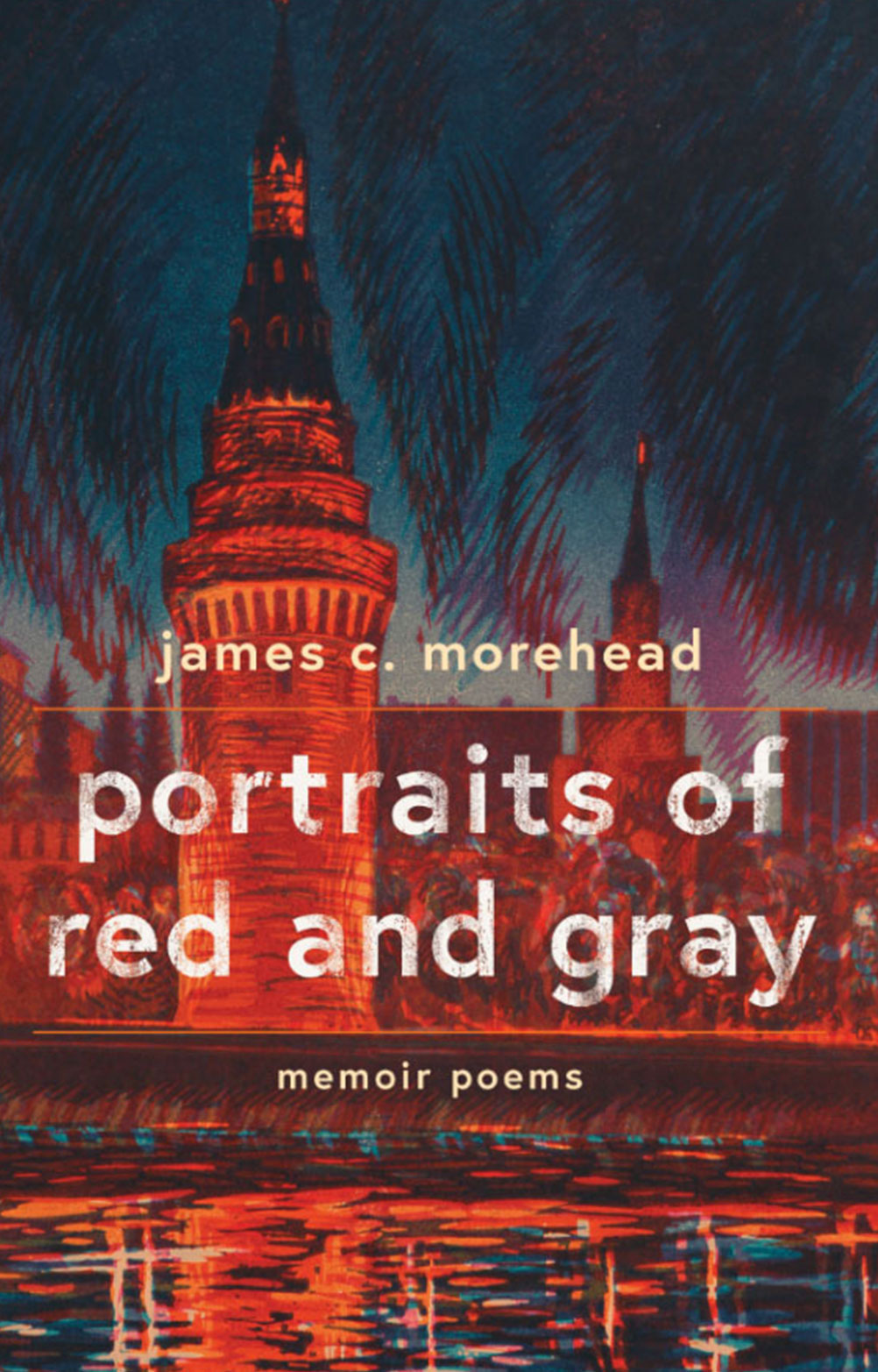
Morehead: That’s fascinating. For my upcoming book “portraits of red and gray” you found an extraordinary lithograph for the cover art. What is your approach to finding assets used in the book design? I know I’m seeing the tip of the design iceberg when you send me options to consider. What happens behind the scenes, before the client sees the design drafts?
Norvell: “The first filter that I use when I look for stock images is actually the client’s budget. That might come as a surprise to people, but everything that we put on a cover has to be paid for, for copyright purposes. There have been times when an author has sent me a photo they found on Instagram that they’d like to use for their cover. Well, that’s not going to happen, but we can find a similar photo. There are stock websites and they vary in price. I know which ones I’m going to look at, or consider, based on how much a client is able to spend on the cover.
“I have clients all over the map. I have a client in Canada and their stock budget is zero, so I look on museum archive websites, at the Library of Congress. The New York Public Library has an archive that is copyright free. There’s also a website you and I have both use called unsplash.com. It’s fairly new and they have high-res contemporary photography that’s totally free; that’s a great resource as well.
“For your second book, since it was poetry and the main poem took place in Russia, we talked about wanting to have something with a setting relating to Russia. Because it was poetry, I immediately wanted it to be an artwork or a drawing, not a photograph. I went to Bridgeman Images, which is an all-inclusive premiere stock resource that has paintings you see in museums. They have all the rights to all of these artworks and it’s where I found that lithograph, and it was perfect. And I noticed that it was produced the same year that you were in Russia. I was so excited and was crossing my fingers that it would be the cover that you chose.”
Morehead: You design both covers and book interiors. How do you approach connecting the cover and interior designs?
Norvell: “The simplest answer is I take the dominant font used on the cover and I try to figure out ways that I can splash it into the interior. Maybe it’s with the chapter dividers or, if the book is separated into parts I repeat the font from the front into the chapter or part breaks.
“If the typography on the cover is all right justified, then I’ll justify the chapter titles on the inside for the body copy. It should just be an enjoyable reading experience. The only place that I take liberties is with chapter titles, page numbers, the labels of section breaks and the front matter, which is the half title page, the title page, and dedication.
“Another fun way to bring the cover into the Interior is with paragraph breaks. Sometimes it’s just as simple as three dots, or you can have a dingbat, or a symbol. I designed Sarah Graham’s latest novel and snakes are really important in her book. So every paragraph break has this little snake icon and it’s perfect, even though the snake didn’t appear on the cover.”
Morehead: When interviewing copyeditor Brittany Smail for the podcast last year, I asked if she is able to read a book without being distracted by the editing. When you are reading a book are you admiring or critiquing the design? What have you learned from other designers?
Norvell: “I am sometimes critiquing the interior pages. If I see a bad break, maybe there’s a long paragraph, and then the very last line of that paragraph is a single word, in typesetting we would consider that a bad break. With my clients, it’s my responsibility to find them. So sometimes when I’m reading a book put out by one of the top publishers in Manhattan, and I see one of those, I’m like, ‘Hey, why did they get away with that?’ when I’m driving myself crazy looking for those.”
Morehead: The two books you’ve designed for me were both poetry. What are the challenges specific to the form of the book: poetry, prose, a business book, an art book, when designing a book?
Norvell: With poetry, it’s definitely the weird stanzas. There’s a lot of back and forth between me and the poet. With poetry it really comes down to the program [the manuscript] was written in and then how that translates to Adobe InDesign.
“For example, you wrote your [manuscript] on Google Docs, and you used the tab key to tab things over. When I’m moving it into InDesign I’m probably changing the font, so the tabs that you used in your Google Docs aren’t always the same width as the tabs in InDesign. It’s making sure that everything’s lining up the same.
“With a business book, the thing that’s tricky is that there are so many different levels of hierarchy. I need to make sure that the hierarchy is clear to the reader. There’s the chapter title, headers, sub-headers, lists. Maybe quotes have to be offset, maybe quotes are in a box. It’s important to be very orderly with business books so that as the reader, they know. ‘This is the start of a new section’ or ‘This is carrying on the same idea’ or ‘This is still part of that initial header from two sections ago’. These are things we just absorb when we’re reading, and shouldn’t be something we really think about. That’s all due to proper typesetting.”
Morehead: eBooks have carved out a niche but have not taken over the book industry. Print books are very much alive and well. As a self-published author it is a thrill to hold a galley proof of my book in my hands, to crack the cover and flip the pages. Why do you think the physical form of a book has longevity when digital media has taken over in so many other fields?
Norvell: “I think it’s because books are so personal. It’s something we do with ourselves. It’s not really meant to be shared. I think about how Instagram has taken over everyone’s life. We take a picture, we immediately blast it out to thousands of friends. Twitter is such an effective way to get an idea out quickly, but the act of reading is so private. It’s really not meant to be shared and duplicated 100 times. We don’t need to digitize the thing you’re reading, it doesn’t make your experience any better.
“The different forms that are available for books, e-books, audiobooks, and the print form, they’re all perfect for different people at different times. Personally. I love listening to audiobooks at night because my light is off and I can set a timer, and it goes off as I’m drifting off to sleep,
“But I don’t know anyone who wants to go to the beach and read on their phone. I think everyone wants to go to the beach, or get on a plane, with a paperback. I also think that books will be here forever because they hold so much weight in society. You walk into a person’s home, you see their bookshelf, and you immediately know so much about them. You know their passions, you know their political affiliations; such a conversation starter.
“You see a certain spine on the shelf and you’re thinking ‘Oh, I read that. Did you like it?’ We don’t have those moments with ebooks and audiobooks. I love seeing a stack of books that I’ve read over the past year, or maybe the past decade, and seeing all those physical pages stacked on top of each other. I am a huge fan of Karl Ove Knausgård, and when I see My Struggle all lined up, I think, did I really read all those books twice?”
Morehead: For students aspiring to build a career in book design, what role has your education in design at the Pratt Institute played in your career, and what role did internships and practical experience play?
Norvell: “My experience at Pratt was so important to everything else that happened after that. I feel that everything in my career was like a domino effect. I know some career coaches promote a lily pad approach to your career, you hop around from one thing to another. My experience at Pratt led to my internship with Rodrigo Corral, a hugely prolific book cover designer and also the art director at FSG that led to my first job at Simon & Schuster. Having worked with Rodrigo really shaped me, improved my design sense, and gave me clout when I walked into an interview for Simon & Schuster fresh out of school.
“My experience at Simon & Schuster was my entry into the New York City publishing scene and then that led directly to my Penguin Random House experience. Pratt was a great experience for so many reasons, but I’ll just circle in on this one thing: it got me used to getting critiqued about my work. For every single assignment everyone would pin their work upon the walls. We would spend two to three hours talking about our work, and critiquing others, and hearing feedback about your own. That type of experience does not end with art school. That type of experience is brought into the real world. If you aren’t used to feedback after four years of art school watch out, because next is presenting your work to the publisher of a major business imprint at Penguin, who’s been doing this for 30 years, and will have feedback for you. My four years at Pratt were invaluable.”
Morehead: You successfully transitioned to being a freelancer over a decade ago, and now have founded a small business. What advice do you have for designers who are thinking of heading out on their own? What are the advantages and disadvantages of being a freelancer?
Norvell: “You can think about doing it for a very long time. It’s not going to make a difference. When you do it, you just have to do it. If you want to go out on your own, go out on your own. It’s scary. It takes confidence. It takes just jumping off the edge. It’s not a forever decision. You can always go back to a company.
“I always say, make the world work for you rather than working for the world. That’s my approach to everything, and the advantages of being a freelancer outweigh the disadvantages.
“Before the pandemic it, I took my laptop and hit the road for four months, and not a single client ever complained, or thought that they were getting a raw deal. I still worked the same number of hours, I was just working from a hostel in Nicaragua. That’s a huge advantage.
“The biggest difference for me is the ability to turn off email at certain times. I find that it is critical that I get into a flow when I’m designing and I was not able to do that when I was working in house because I was constantly getting interrupted by the necessary things that people needed to interrupt me with. The ability to answer emails for one or two hours, with my coffee in the morning, and then close Gmail and say, ‘I’m going to design this for the next five hours and then check my email again in the afternoon’, it’s not just a blessing, it’s so important to the way that I work.”
Morehead: Finally, share a bit more about your company and the services you provide, and how publishers and authors can contact you.
Norvell: “I’ve been doing book interiors for a little over a year. I realized there’s a lot of demand for it, and there’s also a lot of competition. There’s a lot of companies that do typesetting. What I’m offering with this new company is a super streamlined process and an extremely transparent pricing model. I have these packages that outline everything that’s included in the package. There are no surprises when you work with us.
I have close to 100 templates for the clients to choose from. They can all be customized in different ways, depending on the package that you choose. Clients give me their manuscript and we lay it out, send it back, and that starts the editing process. The whole thing is really simple and streamlined and takes all the headache out for the client.
“As far as I know, there is no software out there that will take your manuscript and just spit out a book with all of the things that are needed for a manuscript to become a book: the page numbers, the page labels, chapter breaks, chapter openers. And if it’s a business book, the different tiers of hierarchy. Typesetting is also a personal process, it hasn’t been automated. Let’s see if I’m eating these words in 50 years. I don’t think I will be. It’s an incredibly personal endeavor to take your manuscript and make it into a book, in the sense that we all recognize a book to be, this linear thing, with pages with labels that we depend on to know where we’re at, and what type of book we’re digesting. I’m really excited about it. It’s something I’m doing in addition to cover design, but it’s something I realized that I do really well and I’ve created a process that’s just very streamlined. It’s something I’ll be doing in tandem with my cover design work.”
You can learn more about Zoe’s book design businesses at https://www.ineedabookinterior.com/ and https://www.zoenorvell.com/.


![Allison Mei-Li Explores the Joys and Sorrows of Motherhood in “a history of holding” [INTERVIEW]](https://i0.wp.com/viewlesswings.com/wp-content/uploads/2026/03/Allison-Mei-Li-headshot-2.jpg?fit=1080%2C1350&ssl=1)
![Mikhail Iossel Explores Identity and Breaking from the Past in “Sentence” [INTERVIEW]](https://i0.wp.com/viewlesswings.com/wp-content/uploads/2025/10/photo-iossel.jpg?fit=483%2C949&ssl=1)
![Rickey Laurentiis Reclaims Trans Identity Antecedents in “Death of the First Idea” [INTERVIEW]](https://i0.wp.com/viewlesswings.com/wp-content/uploads/2025/10/laurentiis_rickey-e1759705606462.jpg?fit=307%2C410&ssl=1)
0 Comments
Trackbacks/Pingbacks